Help |
Home
» Library
» Authors
» Bullitt
A Guide to Learning the Pali Language
by
John Bullitt
Copyright © 2004 John Bullitt
For free distribution only.
You may re-format, reprint, translate, and redistribute this work in any medium,
provided that you charge no fees for its distribution or use.
Otherwise, all rights reserved.
Contents ![[go to top]](../../../icon/scrollup.gif)
See also: "Web resources for Pali students"
It's not difficult to learn a little Pali through self-study, using a textbook or two as a guide. Many people find it helpful to study with others, either in a formal classroom setting or in a more relaxed Pali study group. For many of us, the goal is not to become expert scholars and translators of the language, but simply to become acquainted with enough of the basics of the language to enrich our personal understanding of the suttas and the Buddha's teachings. For self-study, Warder's Introduction to Pali or de Silva's Pali Primer are the basic texts. Johansson's Pali Buddhist Texts Explained to the Beginner is also immensely helpful. See the list of Pali language textbooks for more recommended titles.
Formal classroom courses in Pali are offered at many universities with strong Eastern Religions departments as well as at several Buddhist studies centers and institutes (see the University of Minnesota's list of » schools that teach less commonly taught languages, such as Pali). Some university-level Pali courses require previous acquaintance with Sanskrit. If you are looking for a Pali teacher, consider asking around at a university to see if there might be a graduate student willing to tutor you or your study group, perhaps for a small fee. Some professors may be willing to let you audit a course without going through the official university registration process.
There are several good websites offering Pali resources that you may find helpful.
Coping with Pali diacritical marks
Pali is a phonetic language with no written alphabet of its own. Students of the language have therefore relied on their own native alphabets to read and write Pali, ever since the 1st century BCE, when Sri Lankan scribes first recorded the Tipitaka in the Sinhala alphabet. But the Europeans who began to take an interest in South Asian languages in the 19th century quickly discovered that their own roman alphabet was no match for the wide range of phonemes (sounds) present in South Asian languages. European scholars thus began representing the more problematic Pali phonemes by augmenting the roman alphabet with a system of letter-pairs and diacritics, including the macron (horizontal bar), dot-over, dot-under, and tilde:

Until well into the mid-20th century, Pali typefaces using these characters were used almost exclusively by specialty book publishers; a scholar's day-to-day duties of transcribing, translating, and editing had to be laboriously carried out with typewriter, pen, and a steady hand with which to apply the diacritics. Unfortunately, the first personal computers failed to address the typographic challenge of diacritics, as they were designed around a very limited character set (ASCII) that was only barely able to accommodate the upper- and lower-case roman letters, ten digits, and a modest sprinkling of punctuation marks. The extended-ASCII set, which soon followed, offered a suite of additional special symbols, including many required for northern- and eastern- European alphabets. But still no macrons or dot-unders. In the absence of a universally accepted computer representation of non-ASCII characters, students of non-European languages were left to invent their own stopgap methods. These range from giving ordinary punctuation marks double-duty as stand-ins for diacritics, to designing special diacritic fonts (all of which are incompatible with each other), and everything in between.
A good written phonetic representation of Pali — indeed, of any language — using one's native alphabet as a starting point should aspire to each of the following ideals:
- It should be readable by a wide audience. It should introduce a minimum of special characters that are not already present in the alphabet. It is better to modify an existing letter with a small diacritic than to introduce an entirely new character that may look like an alien squiggle to the uninitiated. A newcomer to Pali, upon seeing a t with a dot-under, should be able to guess immediately that the letter stands for some variant of a t sound.
- It should be phonetically precise. The written text should precisely and accurately capture the phonetic content. Each phoneme (sound) should be unambiguously represented by a unique letter or combination of letters.
- It should be easy to type. Writing Pali should not be a cumbersome exercise in keyboard gymnastics. Typing an a-macron should not call for a long series of keystrokes (e.g., Alt-Ctl-Shift-Esc-a).
- It should be portable. If you hand me a book — or send me a text file by e-mail — it should appear to me exactly as it did to you. I should be able to sound out the text phonetically exactly as you intended.
No single method simultaneously realizes all of these goals; no single method is "best." (I should note, however, that one system — Unicode — holds exceptional promise — but not until its fonts and keyboard mappings become more seamlessly and universally integrated into the mainstream of word processors, HTML authoring software, and web and e-mail clients.) The choice of which method to use therefore depends both on your particular needs (e.g., Do you demand phonetic precision? Are you printing a book or dashing off a quick e-mail?) and on the typing, printing, and computing resources you have at your disposal (e.g., Do you have a Pali font? Does your PC support Unicode?).
In what follows I've singled out some of the more common strategies that Pali students have used in recent decades, running the gamut from ignoring diacritics altogether to using Unicode fonts. I evaluate the success of each strategy in achieving the above-mentioned goals, to help you decide which method best suits your needs.
- Method 1. Ignore the diacritics
- This is certainly the simplest method. But the cost of that simplicity is heavy: the irretrievable loss of crucial pronunciation details. This is the method I use at Access to Insight. (I should add that I do make use of the palatal nasal ñ because it is so easy to implement using HTML and because it is contained in the extended-ASCII character set found on practically everyone's computer nowadays.)
| Examples |
- panatipata veramani sikkha-padam samadiyami 1
(HTML: panatipata veramani sikkha-padam samadiyami)
- itihidam ayasmato kondaññassa, añña-kondañño'tveva namam, ahositi 2
(HTML: itihidam ayasmato kondaññassa, añña-kondañño'tveva namam, ahositi)
|
| Evaluation |
| Readability = |
Excellent. |
| Phonetics = |
Poor. |
| Ease of use = |
Excellent. |
| Portability = |
Excellent. |
| Overall = |
Fair. Its phonetic imprecision renders it next to useless in substantive discussions of Pali grammar. |
| Uses: |
- informal correspondence
- e-mail
- OK for low-budget print projects that don't require linguistic precision
|
|
- Method 2. Use capital letters
- Capitalized letters represent letters with an accompanying diacritic. The method is simple, but it has ambiguities: how, for example, would you distinguish between the palatal and guttural n (n with a dot-under, and n with a dot-over)?
| Examples |
- pANAtipAtA veramaNI sikkhA-padaM samAdiyAmi
(HTML: pANAtipAtA veramaNI sikkhA-padaM samAdiyAmi)
- itihidaM Ayasmato koNDaññassa, añña-koNDañño'tveva nAmaM, ahosIti
(HTML: itihidaM Ayasmato koNDaññassa,
añña-koNDañño'tveva nAmaM, ahosIti)
|
| Evaluation |
| Readability = |
Poor. The ever-shifting case is disturbing. When caps appear at the end of a word it looks like mirror writing. |
|---|
| Phonetics = |
Fair. The palatal n and guttural n are indistinguishable. |
|---|
| Ease of use = |
Good. It may take time to get used to the shift key's new significance. |
| Portability = |
Excellent. |
| Overall = |
Fair. The manic appearance of caps at random points is hard to bear. |
| Uses: |
- informal correspondence
- e-mail
- not suitable for print
|
|
- Method 3. The Velthuis scheme: double the vowels, punctuate the consonants
- This scheme was originally developed in 1991 by Frans Velthuis for use with his "devnag" Devanagari font, designed for the TEX typesetting system (see » http://www.ctan.org/). Pali and Sanskrit scholars have since adopted it as a standard technique in Internet correspondence (see, for example, the » Pali Text Society and the » Journal of Buddhist Ethics). In the Velthuis scheme two basic rules are observed:
- Long vowels (those usually typeset with a macron (bar) above them) are doubled: aa ii uu
- For consonants, the diacritic mark precedes the letter it affects. Thus, the retroflex (cerebral) consonants (usually typeset with a dot underneath) are: .t .th .d .dh .n .l. The pure nasal (niggahiita) m, also typeset with a dot underneath, is .m. The guttural nasal (n with a dot above) is represented as "n . The palatal nasal (n with a tilde) is ~n.
Of the plain-ASCII methods, this one is the most precise, as it carefully preserves the significance of each special character. To the uninitiated, however, the sight of all those doubled vowels and misplaced periods is utterly bewildering, perhaps leaving them to wonder if someone's keyboard is broken.
| Examples |
- paa.naatipaataa verama.nii sikkhaa-pada.m samaadiyaami
(HTML: paa.naatipaataa verama.nii sikkhaa-pada.m samaadiyaami)
- itihida.m aayasmato ko.n.daññassa, añña-ko.n.dañño'tveva naama.m, ahosiiti
(HTML: itihida.m aayasmato ko.n.daññassa, añña-ko.n.dañño'tveva naama.m, ahosiiti)
|
| Evaluation |
| Readability = |
Fair. Text looks like it has been sprinkled with typos. |
|---|
| Phonetics = |
Excellent. |
|---|
| Ease of use = |
Good. Requires learning the dual significance of the period and double-quote keys. |
| Portability = |
Excellent. |
| Overall = |
Good. |
| Uses: |
- formal scholarly correspondence
- e-mail
- not suitable for print (except low-budget projects that require scholarly precision)
|
|
- Method 4. Use a little HTML
- HTML has access to the extended ASCII character set, which includes many accented non-English European vowels (umlaut, circumflex, etc.), some of which can serve as reasonable stand-ins for the long Pali vowels (ä ï ü; à ì ù; or â î û etc.). The palatal n is straightforward: ñ. Whatever type of accent you adopt, use it consistently.
| Examples |
- pânâtipâtâ veramanî sikkhâ-padam samâdiyâmi
(HTML: pânâtipâtâ veramanî sikkhâ-padam samâdiyâmi)
- itihidam âyasmato kondaññassa,
añña-kondañño'tveva nâmam, ahosîti
(HTML: itihidam âyasmato kondaññassa,
añña-kondañño'tveva nâmam, ahosîti)
|
| Evaluation |
| Readability = |
Very good. |
|---|
| Phonetics = |
Fair. The consonantal diacritics are missing. |
|---|
| Ease of use = |
Good. Easy to produce using most HTML authoring tools. |
| Portability = |
Good. Limited to web browsers and other HTML-savvy software. |
| Overall = |
Fair-Good. Improves upon the capital letter method, but doesn't capture the consonantal diacritics. |
| Uses: |
- informal correspondence
- e-mail, web, print
|
|
- Method 5. Velthuis plus HTML
- This method attempts to clear up the stuttering of Method 3's doubled vowels, by using a little HTML (Method 4).
| Examples |
- pâ.nâtipâtâ verama.nî sikkhâ-pada.m samâdiyâmi
(HTML: pâ.nâtipâtâ verama.nî sikkhâ-pada.m samâdiyâmi)
- itihida.m âyasmato ko.n.daññassa,
añña-ko.n.dañño'tveva nâma.m, ahosîti
(HTML: itihida.m âyasmato ko.n.daññassa,
añña-ko.n.dañño'tveva nâma.m, ahosîti)
|
| Evaluation |
| Readability = |
Fair. It looks like it has typos, although perhaps not quite as many as pure Velthuis. |
|---|
| Phonetics = |
Excellent. |
|---|
| Ease of use = |
Fair. More complex than Velthuis, since it requires a combination of special punctuation and the use of special HTML characters. |
| Portability = |
Good. Limited to web browsers and other HTML-savvy software. |
| Overall = |
Fair. Although this hybrid does slightly improve the appearance of Velthuis, it still looks like an error-filled jumble. |
| Uses: |
- informal correspondence (scholars who demand precision are bound to prefer good old pure Velthuis)
- not generally suitable for e-mail
- not suitable for print
|
|
- Method 6. Special Pali fonts
- For high-quality print projects, nothing beats a well-designed Pali font. Some of the more popular ones include:
- K.R. Norman's MyTymes and Normyn (TrueType and PostScript versions, for Mac and Windows). They are good — and free.
- Macintosh users: †Download norman-mac.sitx.hqx
(BinHexed Stuffit Expander archive; Internet connection required).
Use Stuffit Expander or some other utility to un-Binhex and un-stuff this file. This will create a folder on your hard disk containing the fonts you need. To install: Mac OS 7-9 users: drag the fonts onto your System folder; Mac OS X users: drag the fonts into the /Library/Fonts folder.
- PC users: †Download norman-pc.zip
(zipped archive; Internet connection required).
Unzip this file. Install the Truetype fonts "Normyn.ttf" and its italic equivalent "Mytymes.ttf" according to the instructions in your Windows manual.
- Alec McAllister's » "LeedsBit" shareware fonts are in widespread use on the Internet. Contact » its creator for more information.
- Pierre Robillard's DPalatino diacritic font (for Macintosh computers) is excellent, and has been used for many years by Wisdom Publications in such books as The Long Discourses of The Buddha, The Middle Length Discourses of the Buddha, and The Connected Discourses of the Buddha. They are available on the web from » Columbia University.
The Association for Insight Meditation's » Pali Font Resources page offers several ANSI and Unicode fonts suitable for working with Pali.
| Examples (using "Normyn" font): |
|
| Evaluation |
| Readability = |
Excellent. |
|---|
| Phonetics = |
Excellent. |
|---|
| Ease of use = |
Variable — it depends on the keyboard mappings used by a particular font. |
| Portability = |
Poor. These fonts don't share the same coding standards; they are not interchangeable. If I send you a text document that I formatted using diacritic font X, and you display it using diacritic font Y, the Pali characters will not show up properly. |
| Overall = |
Excellent — but only for documents that are to be shared in print (hard copy) form or as PDF files or GIF images. |
| Uses: |
- printing
- not suitable for e-mail or the web, except when embedded in PDF files or GIF images. Some may find it easier to print if you convert a PDF to a Word document. Or if you are the type that likes to use spreadsheets, you may find it useful to convert PDF to Excel.
|
|
- Method 7. Unicode and Unicode fonts
- » Unicode has emerged in recent years as the international standard for representing characters from most of the world's alphabets. All the special characters we need for Pali transliteration may be found in Unicode's »† Latin Extended-A, and »† Latin Extended Additional code charts. They can therefore be easily generated using HTML, provided that your web browser uses a Unicode-savvy font.
There are many Unicode fonts available that contain the characters needed for Pali. Two useful sources are the Association of Insight Meditation's " » Pali Font Resources" and BuddaSasana's " » Unicode Fonts for Romanized Viet-Pali-Sanskrit"
The following table lists the HTML Unicode entities required to generate each of the special Pali characters. If your web browser supports Unicode, the characters appearing in the last column of the table should resemble those appearing the shaded column. If they do not match, then you may have to upgrade your web browser, install Unicode fonts on your computer, or both. For details about configuring your computer and browser to use Unicode, see the » Unicode website.
| Pali letter |
Velthuis code |
Unicode |
| HTML entity |
Rendered on
your browser as3 |
| A macron |
 |
AA |
Ā |
Ā |
 |
aa |
ā |
ā |
| I macron |
 |
II |
Ī |
Ī |
 |
ii |
ī |
ī |
| U macron |
 |
UU |
Ū |
Ū |
 |
uu |
ū |
ū |
| N dot-over |
 |
"N |
Ṅ |
Ṅ |
 |
"n |
ṅ |
ṅ |
| M dot-under |
 |
.M |
Ṃ |
Ṃ |
 |
.m |
ṃ |
ṃ |
| N tilde |
 |
~N |
Ñ |
Ñ |
 |
~n |
ñ |
ñ |
| T dot-under |
 |
.T |
Ṭ |
Ṭ |
 |
.t |
ṭ |
ṭ |
| D dot-under |
 |
.D |
Ḍ |
Ḍ |
 |
.d |
ḍ |
ḍ |
| N dot-under |
 |
.N |
Ṇ |
Ṇ |
 |
.n |
ṇ |
ṇ |
| L dot-under |
 |
.L |
Ḷ |
Ḷ |
 |
.l |
ḷ |
ḷ |
| Examples |
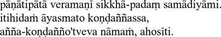
- pānātipātā veramaṅī sikkhā-padaṁ samādiyāmi
(HTML: pānātipātā veramaṅī sikkhā-padaṁ samādiyāmi)
- itihidaṁ āyasmato Koṇḍaññassa, añña-koṇḍañño'tveva nāmaṁ, ahosīti
(HTML: itihidaṁ āyasmato Koṇḍaññassa, añña-koṇḍañño'tveva nāmaṁ, ahosīti)
|
| Evaluation |
| Readability = |
Excellent. |
|---|
| Phonetics = |
Excellent. |
|---|
| Ease of use = |
Poor-Good, depending on the particular software you use (HTML authoring program, word processor, e-mail client, etc.). |
| Portability = |
Good-Excellent. Requires the installation of at least a basic set of Unicode fonts. |
| Overall = |
Good. Still a little cumbersome to use in some software apps, a shortcoming that will probably fade in the next few years. |
| Uses: |
- web
- printing (with well-crafted Unicode fonts)
- suitable for e-mail only if software permits easy typing of Pali characters
|
|
There are quite a few Pali books out there, but so far none surpasses the breadth and depth of A.K. Warder's superb Introduction to Pali. de Silva's Pali Primer, a relative newcomer to the Pali textbook scene, offers a light and refreshing complement to the high-density Warder. If you're trying to learn Pali on your own, it can be helpful to have several books to turn to, as each offers its unique perspective on the language.
- Introduction to Pali, by A.K. Warder
London: Pali Text Society, 1963; rev. 1991
464pp, with exercises.
About $15 from Pariyatti. Companion audio CD also available.
Known popularly as "Warder," this is the standard Pali textbook widely used today. It is systematic and thorough, ideally suited to those with some prior familiarity with basic linguistic concepts (case, declension, gender, etc.) or to the motivated newcomer. Although beginners may at first find some of Warder's explanations impenetrable, it's still the best overall Pali textbook around.
Each chapter contains numerous exercises or passages for reading and translation. Unfortunately, the latest edition contains answers to only the first seven exercises. For complete answers to the first twenty exercises, see John Kelly's "Answer Key to Warder's Introduction to Pali." Kelly's answers cover the Pali-to-English, English-to-Pali, and "passages for reading" exercises, in both literal and fluent translations. The Pali Text Society website also offers » answers to English-to-Pali Exercises 7-30.
The companion CD is well worth purchasing, as it gives the student a good idea of what "real" spoken Pali should sound like.
- Pali Primer, by Lily de Silva
Igatpuri, India: Vipassana Research Institute, 1994
154pp.
Vipassana Research Institute
Dhammagiri
Igatpuri 422403
Maharashtra, India
Available by mail order via the Pariyatti Book Service.
This is a nice first book for those who think they're not ready yet for Warder. Each chapter focuses on a single concept of Pali grammar, and contains numerous exercises. I found, though, that there comes a point in the book (somewhere around Lesson 11) when the brief grammatical introductions in the beginning of the lessons begin to fall short. In particular, there is no explanation of word order in Pali sentences. At this point, Warder can come to the rescue. An Appendix to the book, containing solutions to the exercises, is reportedly forthcoming from the publisher.
- Pali Buddhist Texts Explained to the Beginner, by Rune E.A. Johansson
Scandinavian Institute of Asian Studies Monograph Series, No. 14. London: Curzon Press, 1981
160pp.
This book consists of 52 short chapters, each consisting of a brief passage from the Pali Canon along with a word-for-word grammatical analysis and translation. Useful to the student with some prior grasp of the fundamentals of Pali, or when used in parallel with Warder (above). It also stands well on its own for newcomers who wish to develop a "feel" for the language. An excellent 25-page summary of Pali grammar appears in the back of the book. The book has been difficult to find in the US lately, although it has surfaced in bookshops in Britain and Asia. If you can't find it, write to the publisher: Scandinavian Institute of Asian Studies, Kejsergade 2, DK-1155 Copenhagen K.
- A New Course in Reading Pali: Entering the Word of the Buddha
New Delhi: Motilal Banarsidass Publishers, 1998
207pp. ISBN 81-208-1440-1 cloth, 81-208-1441-x paper. About $20.
I haven't seen this one yet, although I've heard several favorable reports about it. From the dust jacket (courtesy of Henry Grossi):
This book is intended to serve as an introduction to the reading of Pali texts. For that purpose it uses authentic readings especially compiled for the purpose drawn largely from Theravada canonical works, both prose and poetry. The readings are in Roman script, and carefully graded for difficulty, but they have also been selected so that each of them is a meaningful and complete reading in itself, so as to introduce some basic concepts and ways of thought of Theravada Buddhism. This book thus offers an opportunity to become acquainted with the ways in which the teachings of the Buddha are embodied in the language; a sense that is impossible to determine from English translations. The book contains 12 lessons. Each of them has three parts: (1) a set of basic readings and an accompanying glossary, (2) grammatical notes on the forms of the lesson, and (3) a set of further readings with its own glossary. The further readings introduce no new grammatical points, but reinforce ones already presented and give further practice in them. The work concludes, fittingly, with the Buddha's first sermon, The Dhammacakkappavattana Sutta. A cumulative glossary and index to the grammar is also provided.
- An Elementary Pali Course, by Narada Thera
Second edition, 1952.
Several on-line versions are available.
- The New Pali Course — Parts I & II, by A.P. Buddhadatta
1937; 268pp.
Available for about $4 + shipping from the Buddhist
Cultural Centre, Sri Lanka.
Topics are arranged systematically in short, digestible chunks (e.g., "The Alphabet," "Pronunciation," "Parts of Speech"). Sometimes more explanation would be helpful. Lots of good exercises, but no answers are given. This would work best in a teacher-led course, rather than as a tool for self-study.
- Pali Language by E. Muller
Delhi: Bharatiya Book Corporation, 1986
144pp. Available at bookstores in Asia.
A compact grammar, written in 1884. Sanksrit students may find it useful, as it compares and contrasts Pali and Sanskrit at every turn. Not recommended for the rank beginner.
- A Pali Grammar, by N.C. Vidyabhushan and M.K. Ghose
Calcutta: Kiron Moy Ghose, 1982
90pp. Available at bookstores in Asia.
Another Pali grammar, similar to The New Pali Course, above, but without any exercises. Useful as a compact reference book after you've learned the basics.
- Buddhist Dictionary, by Nyanatiloka Thera
Kandy: Buddhist Publication Society, 1988
260pp. About $20, from
Pariyatti Book Service, and the Buddhist Publication Society.
This one is a classic. It's a fascinating mixture of Pali and English words, arranged in English word order (e.g., "Killing... Kiñcana... Kiriya... Knowledge..."). Most entries have thorough explanations with references to passages in the Pali Canon. Excellent tool for beginner and veteran, alike.
- Concise Pali-English Dictionary, by A.P. Buddhadatta
Delhi: Motilal Banarsidass, 1989
295pp. Available by mail from the publisher: Motilal Banarsidass, Bungalow Road, Jawahar Nagar, Delhi 110 007, India.
Very handy for quickly finding the meaning of a word, without the detailed grammatical and contextual analysis offered by the Pali-English Dictionary.
- A Dictionary of Pali (Vol I: A-Kh)
Oxford: Pali Text Society, 2001
778pp. About $50, from Pariyatti Book Service.
This impressive new dictionary has several improvements over the classic PED, including the use of Pali quotations from the Canon to illustrate the meaning of words, instead of simply references to those passages. The publication date for volume II has not yet been set.
- English-Pali Dictionary, by A.P. Buddhadatta
London: Pali Text Society, 1979
588pp. $48 through Wisdom Publications.
What are the various Pali words for "mind"? How do you say "penknife" in Pali? (!) This handy book can be particularly valuable when exploring Pali-English translations — your own or others'.
- Pali-English Dictionary
London: Pali Text Society, 1986
754pp. About $40, from Pariyatti Book Service.
The primary table-top reference tool for the Pali student. Affectionately known as the PED.
Notes
1.
The first of the five precepts: "I undertake the precept to refrain from taking life."
2.
The last line of the Buddha's first sermon (SN LVI.11):
"And that is how Ven. Kondañña acquired the name Añña-Kondañña — Kondañña who knows."
3.
These characters will display properly only when your browser is set with a
default font that contains appropriate Pali Unicode characters.